How to Tell If Cartoon Graphics Are Screen Printed Right
You just dropped cash on a custom lax hoodie with your team's cartoon logo, but after three washes the design looks like it went through a wood chipper. Been there. Whether you're rocking lacrosse hoodies between games or repping your squad on tournament weekends, knowing how to spot quality cartoon screen printing saves you money and keeps your gear looking fresh all season.
Screen printing is the gold standard for lacrosse apparel because it holds up to the abuse we put our gear through-locker room floors, equipment bags, post-practice grass stains, you name it. But not all screen printing is created equal, and cartoon graphics can be especially tricky since they rely on bold colors and crisp lines to look right.
Here's how to tell if your cartoon graphics are printed right, what to look for when buying new gear, and the red flags that signal cheap work.
Check the Ink Thickness and Texture
Quality screen printing should feel slightly raised when you run your fingers across the design. That's the ink sitting on top of the fabric, which is exactly what you want. Cartoon designs typically use spot color printing-solid blocks of color without gradients-so each color should have consistent thickness across the entire printed area.
If the ink feels thin or you can see the shirt color bleeding through solid areas (especially on dark fabrics), that's a problem. Quality prints use enough ink to achieve full opacity. This matters most for poles and LSMs who are constantly moving-thin prints crack faster when fabric stretches.
The texture should also be uniform. Run your hand over the entire design. You shouldn't feel ridges, gaps, or areas where the ink suddenly gets thicker. Inconsistent texture means the squeegee pressure wasn't even during printing, which leads to premature cracking and fading.
Look for Clean, Sharp Edges on Every Line
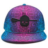
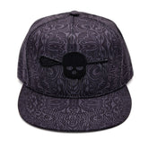
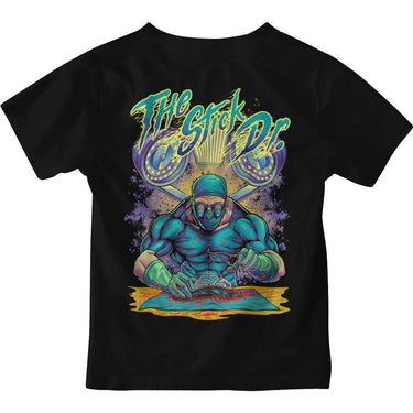
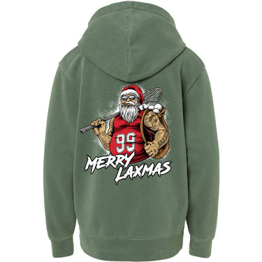
Cartoon graphics live or die by their edges. Whether it's your team's mascot or a skull design on your favorite lacrosse apparel, those black outlines and color transitions should be razor-sharp. Get up close and inspect where colors meet-there shouldn't be any bleeding, blurring, or jagged edges.
Blurry edges happen when the screen isn't properly aligned or when the mesh count is wrong for the design. Higher mesh counts (230 threads per inch or more) are essential for detailed cartoon work because they create finer weaves that hold crisp lines. If your design looks fuzzy, the printer probably used a lower mesh count meant for simpler graphics.
Check corners and points especially carefully. A quality print keeps sharp angles sharp-no rounding or ink buildup in tight spaces. This is where you'll spot rushed work immediately.
Test Color Registration Across the Design
Screen printing uses a separate screen for each color, and all those screens need to line up perfectly. This is called registration. When colors don't align, you'll see white gaps between color blocks or overlapping edges that create muddy, unintended colors.
Hold your shirt up to natural light and examine areas where multiple colors meet. On a well-printed cartoon design, colors should butt up against each other perfectly with no visible gaps. This matters for tournament weekends when you're representing your team-sloppy registration makes even the coolest design look amateur.
Middies who go through gear fast know this: poor registration is usually the first thing to get worse after washing. If the colors weren't lined up tight from the start, they'll separate even more as the fabric shifts during wear and cleaning.
Inspect the Print on Different Fabric Colors
Printing on dark fabrics is harder than printing on white or light colors, and it's where you'll see quality differences most clearly. Quality cartoon screen printing on black or navy lacrosse tees requires an underbase-a layer of white ink printed first so colors stay vibrant on top.
If you're buying dark-colored gear, look at the brightness of the colors. They should pop just as much as they would on a white shirt. Dull or muted colors mean either no underbase was used, or it was too thin. This is especially important for reds, yellows, and light blues.
Also check for any dark fabric color showing through the printed areas. On a quality print, you shouldn't see the shirt color peeking through at all. Tendies who rock dark practice gear know this-if you can see fabric through the print when it's new, it'll be completely faded after a few weeks of cage sessions.
Do the Stretch and Wash Test
Here's the real test: gently stretch the fabric where the design is printed. Quality screen printing ink is designed to flex with the fabric. You might see very fine micro-cracks in areas of heavy ink coverage, but the design shouldn't show major cracks, and the ink shouldn't feel like it's pulling away from the fabric.
If the ink immediately shows spiderweb cracks or feels stiff and resistant when you stretch it, that print won't survive wall ball sessions and practice. The ink wasn't properly cured or the wrong ink type was used for the fabric. This is critical for attackmen who need full range of motion-stiff prints restrict movement and crack fast.
After the first wash, inspect the design again under good light. Colors should stay vibrant, edges should remain sharp, and you shouldn't see any peeling at the edges of the print. According to industry standards for quality screen printing, designs should withstand dozens of washes without significant degradation. If your design looks noticeably worse after one wash cycle, the ink wasn't heat-set properly.
Watch for Common Screen Printing Defects
Certain defects immediately signal poor quality work. Pinholes-tiny dots where ink didn't fill in-mean the screen had dust or the emulsion wasn't applied correctly. A few microscopic pinholes might be acceptable, but if you can see multiple visible gaps, especially in solid color areas, that's sloppy work.
Ink bleed is another red flag. This shows up as fuzzy edges or ink spreading beyond where it should be, especially on lighter fabrics. Quality printers control this through proper screen preparation and ink viscosity. You'll see this most on detailed areas like small text or thin lines in cartoon designs.
Check for scorching too-brownish or yellowed areas around the print from too much heat during curing. This weakens the fabric and looks terrible. Youth grinders putting their gear through summer camps and fall ball need prints that were cured at the right temperature, not rushed through with excessive heat.
Know When Digital Printing Gets Passed Off as Screen Printing
Some companies use digital printing (basically a fancy heat press) for small orders and call it screen printing. Digital prints feel different-they're smoother, almost plasticky, and sit on top of the fabric like a sticker. They also crack much faster than quality screen printing.
Screen printing has a slight texture and the ink actually bonds into the fabric fibers. Digital prints feel like a separate layer on top. If you're buying custom team gear, ask specifically about the printing method. Screen printing costs more upfront but lasts way longer, especially for high school players grinding through a full season.
The texture test is simple: quality screen printing feels like part of the shirt, while digital printing feels like something added to it. For cartoon designs with bold colors and simple shapes, screen printing is always the better choice for durability and appearance.
Quality cartoon screen printing isn't just about looking good on day one-it's about your gear lasting through two-a-days, tournament season, and countless washes without falling apart. Before you buy, inspect those edges, test the stretch, and make sure what you're getting is actually screen printed right. Your gear takes as much abuse as you do, so it better be built to match. When you're ready for apparel that's printed to last, check out our full collection designed by players who get it.

